A repository used to provide an introduction to dataviz in Python

This repository contains an introduction to dataviz in Python with a focus on browser based, interactive dataviz. Installation git clone https://github.com/MarcSkovMadsen/dataviz-in-python.git python -m venv .venv source .venv/Scripts/activate pip install -e .[all] Serve the presentation panel serve src/dataviz_in_python/presentation/*.py You can view the presentation at http://localhost:5006/introduction. GitHub View Github    

Read more

Leyna’s Visualizing Data With Python

Below is information on the number of bilingual students in three school districts in Massachusetts. You will also find information on how the average number of women in national parliament worldwide has changed since 2000. Graph 1: Number of Bilingual Students in Massachusetts School Districts Amherst and Worcester had similar numbers of bilingual students, 6235 and 6541 respectively. Reading, however, has more than double of Amherst and Worcester combined — 27508. Data on the number of bilingual students for all […]

Read more

Includes all files needed to satisfy hw02 requirements

Mean Scale Score for Asian and Hispanic Students, Grades 3 – 8 This dataset provides insights into the New York City education system across Asian and Hispanic catagories. The students have different eudcation scale scores across multiple grades. I hope that this visual graph can help provide insight on race, grades, and mean scale scores to depict the a small part of the New York education system. Data Set Average Sea Level Pressure compared to Air Temperature for Ocean Waters […]

Read more

A Python package providing rich and interactive visualizations

vprof is a Python package providing rich and interactive visualizations for various Python program characteristics such as running time and memory usage. It supports Python 3.4+ and distributed under BSD license. The project is in active development and some of its features might not work as expected. Screenshots Contributing All contributions are highly encouraged! You can add new features, report and fix existing bugs and write docs and tutorials. Feel free to open an issue or send a pull request! […]

Read more

Linked Data Visualizations Across Multiple Files In Python

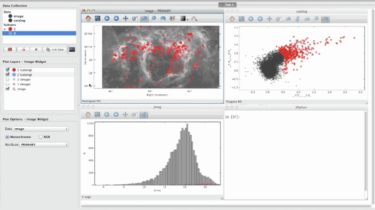
Glue Glue is a python project to link visualizations of scientific datasets across many files. Click on the image for a quick demo: Features Interactive, linked statistical graphics of multiple files. Support for many file formats including common image formats (jpg, tiff, png), ascii tables, astronomical image and table formats (fits, vot, ipac), and HDF5. Custom data loaders can also be easily added. Highly scriptable and extendable. Installation For installation documentation, visit glueviz.org. Contributing If you are interested in contributing […]

Read more

Add Chart.js visualizations to Django admin using a mixin class in python

django-admincharts Add Chart.js visualizations to your Django admin using a mixin class. Example from django.contrib import admin from .models import BillingAccount from admincharts.admin import AdminChartMixin from admincharts.utils import months_between_dates @admin.register(BillingAccount) class BillingAccountAdmin(AdminChartMixin, admin.ModelAdmin): def get_list_chart_data(self, queryset): if not queryset: return {} # Cannot reorder the queryset at this point earliest = min([x.ctime for x in queryset]) labels = [] totals = [] for b in months_between_dates(earliest, timezone.now()): labels.append(b.strftime(“%b %Y”)) totals.append( len( [ x for x in queryset if x.ctime.year == […]

Read more

A fast and easy Data Visulaization tool running on python dash

YATA Yata is a fast, simple and easy Data Visulaization tool, running on python dash. The main goal of Yata is to provide a easy way for persons with little programming knowledge to visualize their data easily. Version v1.0yata This is Yata version 1. No way is it expected to work as we expect, it is the bare bones of the full application, you can test it out to get a general idea of how the script will work!. How […]

Read more

Exploratory data analysis and build powerful data and viz tools using Python

Panel-Chemistry The purpose of the panel-chemistry project is to make it really easy for you to do exploratory data analysis and build powerful data and viz tools within the domain of Chemistry using Python and HoloViz Panel. Check out the panel-chemistry examples on Binder Jupyter Notebook Jupyter Labs Panel Apps 🏁 Background This project is just starting (2021-05-19) and not much more than an idea. It was started by the discussion How to display JSME molecular editor with Panel? in […]

Read more

Dashboard For The DexConnect Platform of Dexterity Global

DexDash Working prototype submission for internship at Dexterity Global Group. Dashboard to for real time analysis of data of connected individuals and institutes across the country. A dashboard built using Plotly-Dash for interactive visualization of Dex-connected individuals across the country. Requirements How to run Install the dependencies by running the command pip install -r requirements.txt Once dependencies are installed, just run python app.py to see it in your browser. Features Map to visualize the connected individuals and institutes Demographics and […]

Read more
1 2 3