Time Series Data Visualization with Python

Last Updated on September 18, 2019
6 Ways to Plot Your Time Series Data with Python
Time series lends itself naturally to visualization.
Line plots of observations over time are popular, but there is a suite of other plots that you can use to learn more about your problem.
The more you learn about your data, the more likely you are to develop a better forecasting model.
In this tutorial, you will discover 6 different types of plots that you can use to visualize time series data with Python.
Specifically, after completing this tutorial, you will know:
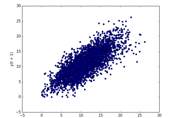
- How to explore the temporal structure of time series with line plots, lag plots, and autocorrelation plots.
- How to understand the distribution of observations using histograms and density plots.
- How to tease out the change in distribution over intervals using box and whisker plots and heat map plots.
Kick-start your project with my new book Time Series Forecasting With Python, including step-by-step tutorials and the Python source code files for all examples.
Let’s get started.
- Updated Apr/2019: Updated the link to dataset.
- Updated Aug/2019: Updated data loading and grouping to use new API.
- Updated Sep/2019: Fixed bugs in examples that
To finish reading, please visit source site