How to use Seaborn Data Visualization for Machine Learning
Last Updated on August 19, 2020
Data visualization provides insight into the distribution and relationships between variables in a dataset.
This insight can be helpful in selecting data preparation techniques to apply prior to modeling and the types of algorithms that may be most suited to the data.
Seaborn is a data visualization library for Python that runs on top of the popular Matplotlib data visualization library, although it provides a simple interface and aesthetically better-looking plots.
In this tutorial, you will discover a gentle introduction to Seaborn data visualization for machine learning.
After completing this tutorial, you will know:
- How to summarize the distribution of variables using bar charts, histograms, and box and whisker plots.
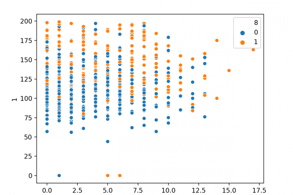
- How to summarize relationships using line plots and scatter plots.
- How to compare the distribution and relationships of variables for different class values on the same plot.
Kick-start your project with my new book Machine Learning Mastery With Python, including step-by-step tutorials and the Python source code files for all examples.
Let’s get started.
 To finish reading, please visit source site