Add Legend to Figure in Matplotlib

Introduction
Matplotlib is one of the most widely used data visualization libraries in Python. Typically, when visualizing more than one variable, you’ll want to add a legend to the plot, explaining what each variable represents.
In this article, we’ll take a look at how to add a legend to a Matplotlib plot.
Creating a Plot
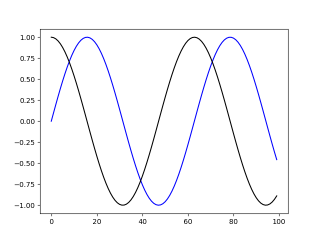
Let’s first create a simple plot with two variables:
import matplotlib.pyplot as plt
import numpy as np

fig, ax = plt.subplots()

x = np.arange(0, 10, 0.1)
y = np.sin(x)
z = np.cos(x)

ax.plot(y, color='blue')
ax.plot(z, color='black')

plt.show()
Here, we’ve plotted a sine function, starting at 0 and ending at 10 with a step of 0.1, as well as a cosine function in the same interval and step. Running this code yields:
Now, it would be very useful to label these and add a legend so