A Gentle Introduction to Data Visualization Methods in Python
Last Updated on August 23, 2019
Sometimes data does not make sense until you can look at in a visual form, such as with charts and plots.
Being able to quickly visualize your data samples for yourself and others is an important skill both in applied statistics and in applied machine learning.
In this tutorial, you will discover the five types of plots that you will need to know when visualizing data in Python and how to use them to better understand your own data.
After completing this tutorial, you will know:
- How to chart time series data with line plots and categorical quantities with bar charts.
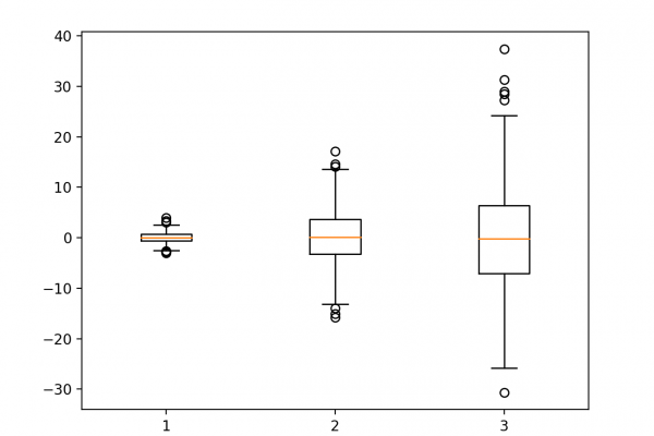
- How to summarize data distributions with histograms and box plots.
- How to summarize the relationship between variables with scatter plots.
Kick-start your project with my new book Statistics for Machine Learning, including step-by-step tutorials and the Python source code files for all examples.
Let’s get started.
- Updated Aug/2019: Updated typo in the description of the IQR.

A Gentle Introduction to
To finish reading, please visit source site